Responsive Youtube videos using aspect ratio
Ever embedded a video from Youtube, but struggled to make them behave the way you'd like? Here's how you can make the embeds full-width and responsive.
The problem with Youtube embeds
If you want to embed a video from Youtube you can click the Share button and choose Embed. You'll be given a code snippet that looks something like this:
<iframe width="500" height="281"
  src="https://www.youtube.com/embed/xvFZjo5PgG0?si=Q9oLLk3o32QYb3ST"
  title="YouTube video player"
  frameborder="0"
  allow="accelerometer; autoplay; clipboard-write; encrypted-media; gyroscope; picture-in-picture; web-share"
  referrerpolicy="strict-origin-when-cross-origin"
  allowfullscreen>
</iframe>
You're promted to copy this and add it to your code, or inject it with any embed options you may have in a CMS.
The code creates an <iframe> with a declared width and height attribute (in this case 500x281) and this is where it gets annoying.
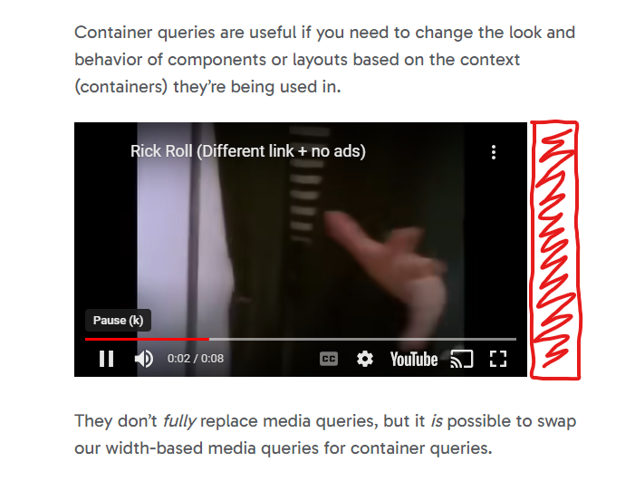
For the sake of the argument, let's say I want to add this to my blog posts. The body section of my blog posts can have a width of 560px (depending on the zoom level, the font-size settings in your browser or the width of your browser window). This means that if I was to put this iframe in a blog post I would get a video that's slightly more narrow than the width of my text.

And when resizing the browser window to something below the video's width of 500px it will overflow horizontally. I certainly don't want that!

You would think you could simply change the width attribute to 100% to counter this behaviour:
<iframe width="100%" height="281"
  src="https://www.youtube.com/embed/xvFZjo5PgG0?si=Q9oLLk3o32QYb3ST"
  title="YouTube video player"
  frameborder="0"
  allow="accelerometer; autoplay; clipboard-write; encrypted-media; gyroscope; picture-in-picture; web-share"
  referrerpolicy="strict-origin-when-cross-origin"
  allowfullscreen>
</iframe>
Or try to fix it with CSS:
.blog-post iframe {
  width: 100%;
}
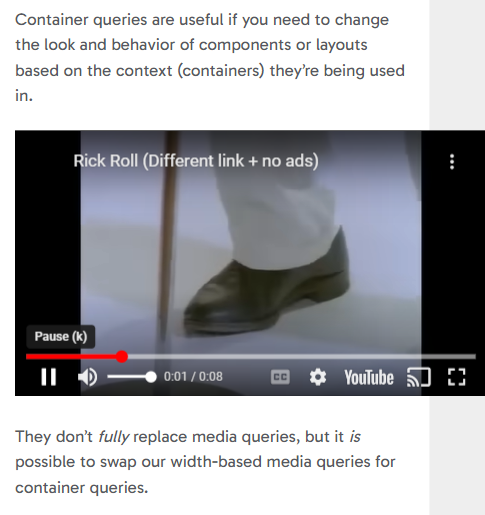
This does make the embedded video full-width and responsive, but it also stretches the video, which is not what we want. This is because the height attribute is still in place.

Sadly, we cannot just remove the height attribute either, this will only damage it further.

We also cannot add height=100%, as this is not the correct way to keep the video's aspect ratio.
And that's our clue to how we can solve this: we want to keep the aspect ratio of the iframe, while still allowing it to fill the available horizontal space.
Solving the problem with aspect-ratio
Most videos on Youtube have an aspect ratio of 16:9. This means we can add this in our CSS, like so:
.blog-post iframe {
  width: 100%; /* To override the attribute */
  height: auto; /* To override the attribute */
  aspect-ratio: 16 / 9;
}
This is great! However, it's not a fix-all solution. Not all videos on Youtube are in a 16:9 format, some are 21:9, others 4:3. So how do we solve that?
Well, the easiest way is to alter the embed code snippet we're given, changing the width to 100%, removing the height attribute, while also adding aspect-ratio with a style attribute:
<!-- ❌ -->
<iframe width="500" height="281" ...></iframe>

<!-- ✅ -->
<iframe width="100%" style="aspect-ratio: 500 / 281" ...></iframe>
Remember, aspect ratios doesn't have to be set to perfect values like 16:9 or 4:3, the syntax is simply width / height. And given that we know the width and height of the video, we can easily set the same values as the aspect ratio, in this case 500 / 281.
A note on Youtube Shorts
Shorts doesn't have an embed option like normal videos have, but they're still embaddable. For some reason they've hidden the option, but if you right-click on the video in your browser, you'll get this context menu:

Here you'll see an option to copy the embed code for this video. The aspect-ratio of Shorts are totally different from normal Youtube videos, but if you change the width, height and style attribute as mentioned it works the same way. Voilá!
<!-- ❌ -->
<iframe width="600" height="1174" ...></iframe>

<!-- ✅ -->
<iframe width="100%" style="aspect-ratio: 600 / 1174" ...></iframe>
In conclusion
Embedding Youtube videos can be annoying, but adding aspect-ratio is a simple fix to the problems. However, if you find it tedious to make changes to the provided iframe code every time you have to embed a video you could add a tiny bit of Javascript to your website for it to fix itself automatically:
function addAspectRatioToYoutubeVids() {
  // Find all the iframe with videos that has a source URL containing 'youtube' or 'youtu.be'.
  const allYoutubeVids = document.querySelectorAll('iframe[src*="youtube"], iframe[src*="youtu.be"]');

  allYoutubeVids.forEach(video => {
    // Get the width and height
    const width = video.getAttribute('width');
    const height = video.getAttribute('height');

    // Set the width attribute and remove the height attribute
    video.setAttribute('width', '100%');
    video.removeAttribute('height');

    // Set the aspect ratio
    video.style.aspectRatio = `${width} / ${height}`;
  })
}

document.addEventListener("DOMContentLoaded", addAspectRatioToYoutubeVids);